Monday, January 29, 2007

Color Palette Trends 2007

Come and meet the mood-evoking personalities of today's color palettes. Images and text from Sherwin Williams. Click on subtitle to read more, and use the online color palette generator.

Balanced Living Color Trend Palette

There's nothing black and white about green. The renewed appreciation for a balanced, healthy lifestyle is evident in organic living and mindbody workouts. Natural fibers, recycled materials, simple furnishings - these are just a few of the touches to create balanced living.

Sultry Origins

From the fashions of Beverly Hills to the street couture of New York City, global ethnic influences are turning up everywhere. Bold, spice-infused colors. Intricate handcrafted quality. Clean, simple lines. A distinctive, Old World feel - these express the essence of sultry origins.

Understated Elegance

Today's neutral palettes are sophisticated. Warm tones blend with cool. Natural materials add depth and character. A pendant lamp adds luster to textures and finishes. Artisan pottery compliments exquisite furniture. It's luxury made affordable. Understated elegance for all.

Virtual Re-mix

Nostalgia is booming. It's the integration of past and present, the visual equivalent of a greatest hits CD, a tendency to mix rather than match. You can see it in all things retro and vintage, from a '60s pattern on a bathroom mat to a claw-foot tub that harkens back to days gone by.

Kinetic Contrasts

Look to fashion and advertising and you will see the impact of kinetic contrasts. It pulsates with energy and style. Intense color accents, spare minimalist backgrounds, geometrically shaped furniture and contemporary art help create this wow factor.

Pantone Designer Paint Colors 2007
When we asked the designers to translate their spring 2007 fashion colors to interior paint colors and describe the room, this is what they said:


Pantone Spring 2007 color trends

Click on subtitle to read more.

More Color Trends 2007

Fashion Trendsetter, online fashion and color forecasting website today announced the release of the Spring/Summer 2008 color trends as two editions; Vol.II and Vol.III. For the summer 2008, two different stories and four sub trend cards are prepared for each color trends... Click on subtitle to read more.

Thursday, January 25, 2007

Tricks for Copying Anything off the Web

1. PRINT SCREEN
Here's a technique that probably no one ever told you. Sometimes web sites try to protect their content by barring you from right clicking and downloading their images. Here's how get around this problem.

With the web site on your screen, press CTRL, SHIFT and PRINT SCREEN on your key board. Your computer has just copied what you see on screen and put it on your paste board.


Now open up Photoshop, to go FILE pulldown menu, select NEW, create a new document (the size will automatically be set up correctly), then PASTE. You will see the image in your Photoshop document. Now you can crop it, select areas and copy, etc.


Mac users often have a program called "Capture" that allows you to do the same thing (just a little easier).

Use wisely - don't forget there are copyright laws and protections.

2. Using Internet Explorer to Download a Web Page
With the web site showing in your browser, go to FILE, SAVE AS, and select "Save as Type: Web Page, complete." The html file and a folder with the images will download. Now you can open up the web page with Dreamweaver, and study how it was constructed.

Tuesday, January 23, 2007

Elements and Principles of Design

These are some of the notes from our class presentation. For the full notes, use class handouts.

Form follows function
The physical properties of the object or the elements used in the design reflect its meaning, use and purpose.

7 Elements of design


Line: Line can be considered in two ways. The linear marks made with a pen or brush or the edge created when two shapes meet.


Shape: A shape is a self contained defined area of geometric or organic form. A positive shape in a painting automatically creates a negative shape.

Direction: All lines have direction - Horizontal, Vertical or Oblique. Horizontal suggests calmness, stability and tranquility. Vertical gives a feeling of balance, formality and alertness. Oblique suggests movement and action.

Texture: Texture is the surface quality of a shape - rough, smooth, soft, hard, glossy, etc. Texture can be physical (tactile) or visual.


Color: Color or the absence of it is significant in your choice of elements.

Size: The fifth element is size, which is how big or small something is. In design, size can can attract or size can organize. Sometimes size is also called “mass.”

Tonal Contrast: Tonal contrast is simply the difference between the light and dark areas in a painting. The greater the difference the more attention the area attracts.

5 Design Principles

1. Balance
The design must be in balance – have an equal distribution of visual weight. Balance in design is similar to balance in physics. A large shape close to the center can be balanced by a small shape close to the edge. A large light toned shape will be balanced by a small dark toned shape (the darker the shape the heavier it appears to be).

Two kinds of balance:
Formal (symmetrical): Fold your page in half, vertically. If one side mirrors the other, than it is symmetrical balance. It communicates stability, seriousness, the classical and trustworthiness. In advertising, it's often used for institutional and other serious-minded advertising.

Informal (assymetrical): Optical weights are balanced (check in mirror to see if one side is balanced with the other). It can communicate creativity, contemporary, unique, playfulness and originality.


In advertising, the space within the ad should be broken up into pleasing proportions. This relates to the size, shape, and weight of elements to one another. There should be a balance between consistency and variety. Use the 1:3 rule.

2. Emphasis
One element (or one part of an advertisement), should dominate all others.
What one item must be emphasized? (The art, headline, copy block, logo?)
How much emphasis should it get?

Create emphasis by using these rules:
a. Our attention is attracted to first to dark elements, and then to light elements;
b. From unusual shapes to usual or geometric shapes (our brain is attracted to biomorphic shapes before geometric shapes);
c. From colour elements to non-colour elements.

3. Direction
A directional pattern should be evident. In advertising, left to right, top to bottom
designer leads the reader by hand through the maze of the advertisement (artwork, headline, logo, body copy, contact information).


4. Rhythm
Created by repeating or varying elements, giving consideration to the space in between them, which establishes a sense of movement from one element to another.
Repetition and variation is key.

5. Unity
A unifying force should hold the ad together. In advertising, a border or white space is often used.

Tuesday, January 16, 2007

Photoshop: Paths


Here is an online video demonstration of how to use Photoshop Paths. I highly recommend that you take a look at them all.

Photoshop Paths

You will need Windows Media to view them.

Cropping Exercise Using Paths


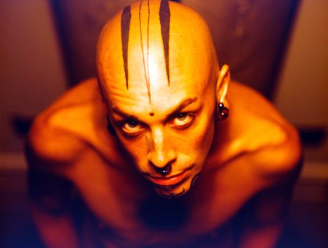
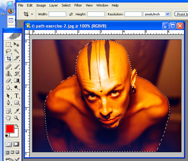
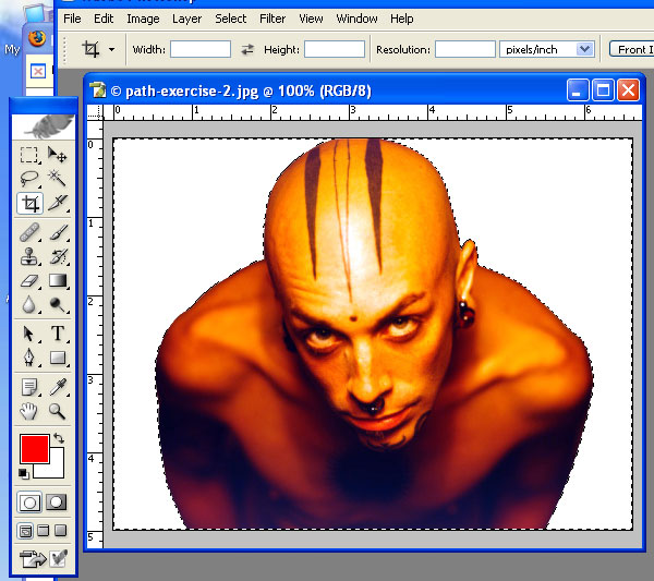
Often you will want to crop out a background, or cut out an object from a photograph. This exercise shows you how. You are going to draw a path around the object - in this case, a bald man. Once the path is drawn, then you will change the path into a "selection," and then inverse the selection, and delete the background.

Instructions:


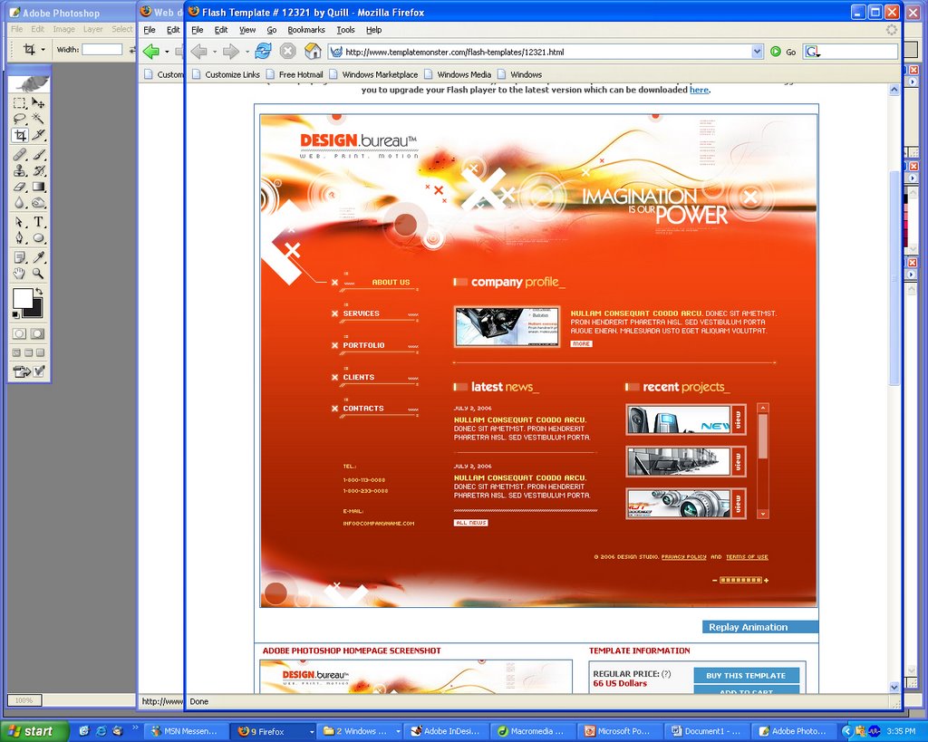
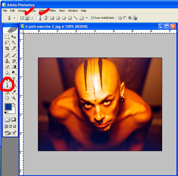
Begin by selecting your Paths Tool. On the context-specific bar on the top, select the "Paths" option, and make sure the "Pen Tools" option is also selected (see red check marks on image).


With your Pen Tool, click to make your Beginning Point of the curve. Click & drag to create the handle bar of your curve - position it half way in between the beginning point and where your end point will go. Let go of your cursor, and then click to make your end point. You have created a curve.


To adjust the arc of your curve, press CTRL and your cursor will turn into an arrow, or pointer. Using the point on the point of the handle bar, move it until the curve fits closely against the object you are drawing around.


To continue the next curve, click on the End Point and drag. This will join the first section of the path to the second section you are creating. Then click an end point. Adjust your curve, and continue. Continue all the way around the object until you have created a CLOSED path - the path should join into one.


Using your Layers Floating Palette, select the PATHS TAB. You will see the path that you created. Using the small arrow on the palette, click to get the pulldown menu, and the select "Make Selection." This turns your path into a selection. Notice that what is selected is the object - not the background.


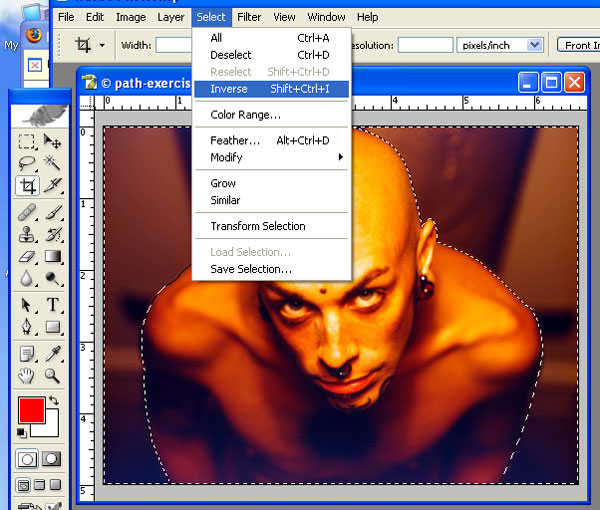
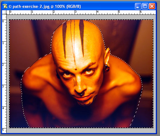
To select the background, you must INVERSE the selection. Go to the SELECT Pulldown Menu, and selection INVERSE. Now notice that the selection area is the background.


To delete the background, first make sure that your background colour on your Tool Bar is set to white. Then press "DELETE" on your keyboard.


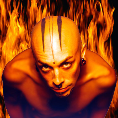
On the other hand, you could copy the figure/object (and not the background) and paste him on top of another photo. In this instance, I've used a fire background.

Monday, January 15, 2007

Photo-Editing Techniques for Portraits

NOTE: If you run into problems with my explanations, always check your Photoshop Visual Quickstart Guide textbook, or the "HELP" pulldown menu in Photoshop.


The professional graphic designer edits digital portraits before publishing them, in order to improve the appearance of the individual and put their "best face forward." Here are some common techniques used to improve portraits.

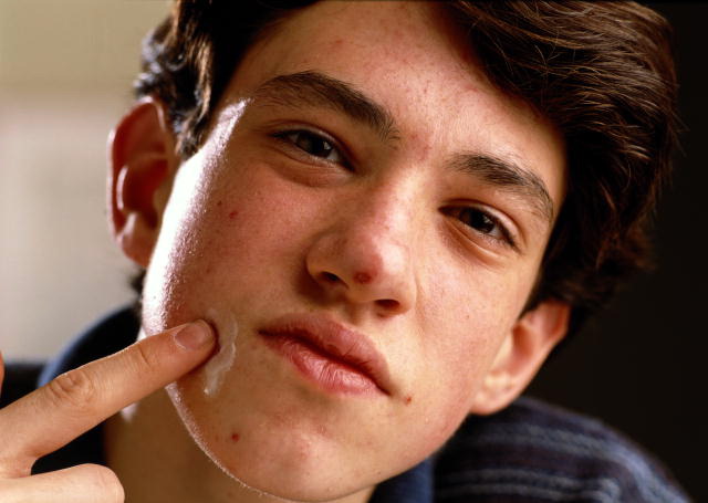
In class, we used this image of a teenage boy with acne.
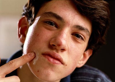

The picture is quite dark and requires more midtones and brightness. So the first thing to do is to change the Image Levels.

Image Levels
In Photoshop with the image open, go to the Image pulldown menu, and select "Adjustments." First try "Auto Levels." This usually works for most photos, but if there are no changes to the image, or it makes the image look worse, then do the following...

Go to the Image pulldown menu, and select "Levels." You will see a graph depicting the dark, medium and light portions of the image. Usually if you pull the middle arrow icon to the left, it will brighten the mid-tones, making the image look better. Sometimes you will need to pull the left arrow icon to the right to make it darker, or the very right arrow icon to the left to make the white areas of the image brighter. Often it is a combination of these - experiment with them until you see an image that balances the dark tones, mid-tones and white-tones of the image. In this instance, I pulled the mid-tones to the left, making them brighter.

Healing Brush (Bandaid Icon) on Tool Bar
To fix the blemishes (pimples) on the model, the Healing Brush tool is used.

Once you've selected the Healing Brush tool, then make sure your brush is an appropriate size, using the context-specific bar across the top. Make the pixel radius of the brush smaller or larger, to get the right size.

Increase the zoom level of your screen (bottom left hand corner) to about 200-400%, so that you can see the detail of the blemish to be removed.

Select an area near the blemish, that is blemish free, and approximately the same colour and value as the area to be corrected. Then press the ALT key, and click in this area, in order to set the area from which the blemish will be corrected. This means that when you click on the blemish with your Healing Brush tool, the sampled area will replace the blemished area. Then through a series of algorithms, Photoshop averages out colour, value, etc. to make the area look as natural as possible, and blend in.

Each time you approach a new blemish to be corrected, select an area that is close to the blemish and is blemish free, ALT click, and then correct the blemish.

Do this until the model is blemish free.

Blur Tool on the Tool Bar
The Blur Tool (it looks like a water droplet) can be used to smooth out skin texture, remove or minimize wrinkles.

Once you've selected the Blur Tool, use the context-specific bar at the top to select an appropriate brush size (pixel radius), "Mode: Normal" and "Strength: 50-100%" to make the changes. The Strength affects how quickly the image area is blurred. If when you try to blur or blend the area and it's going too slowly, then increase the "Strength." This makes the action occur more quickly.

Do this under the eyes, or in any area where you think an area needs to be smoothened. Don't overdo it - it may end up looking unnatural. You may notice that his lips look cracked - blur the areas in his lips to smoothen them somewhat.

The other helpful thing the Blur Tool" can do is lighten areas, while blurring them. So under the eyes, you can lighten the dark circles. Using the context-specific bars across the top, select "Mode: Lighten" - and then move your cursor under the eyes to get a natural looking lightening under the eyes.

The Dodge Tool on the Tool Bar
The Dodge Tool is used to lighten areas, such as the whites of eyes or the teeth. Select the Dodge Tool, then using the context-specific bar on the top, select your brush size, the "Range" - if you're brightened eyes or teeth, the use "Midtones", and how strong the exposure should be. "50%" is usually quite good for this tool.

Then increase the zoom level of your image (using the bottom left hand corner percentage) to about 400%, and click your tool on the white of the eyes. Each time you click, the more it lightens. Try lightening the white reflection in the eye, as well as a bit on the iris. Don't overdo it - make it look natural.

If you make a mistake at any time, using your History Floating Palette, and step backward, until you've restore the image to where you want it.

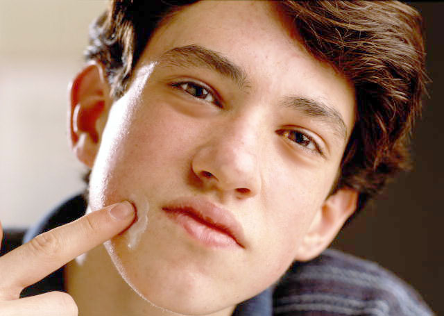
Here's what we've accomplished so far:
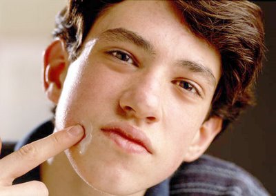

Selection Tools
If you want to make areas of the photo a different colour, or delete them altogether, then it's important to know how to use the selection tools. Photoshop has at least 9 tools to do this. We looked at using the Lasso Tool, Polygonal Lasso Tool, the Magnet Lasso Tool and the Magic Wand Tool. Each has it's own attributes and reasons for using them.

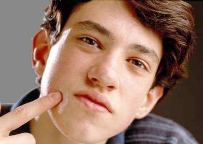
Let's take a look at using the Magic Wand Tool. This tool is good for selecting areas that are similar in hue and value, such as the background of the image on the left hand side. The area is a fairly consistent beige/white, and is very different from the area to its right - the edge of the teenager's face.

Selecting the Magic Wand Tool, use the context-specific bar to decide on the "Tolerance" range. The lower the value, the more it will only select pixels of the same hue and value. The higher the value, the more it select pixels of different hue and value. By experimenting, you can find the right range.

In our photo, I've used "Tolerance:32". When I click on the background (left hand side) it only selects the top 1/3 of this area. By holding down the shift key and clicking in the bottom 2/3 I am able to select the entire area.

In order to select more areas, hold down the shift key. You'll notice that your Magic Wand Tool cursor has a + (plus) sign next to it, indicating you're adding additional selected areas. To subtract areas, use the ALT key. It will show a - (minus) sign.

I noticed that the selected area included a part of the ear that shouldn't be selected (by the earlobe), so I zoomed into the image (300%), pressed the ALT key, then clicked with the Magic Wand Tool, and subtracted the area that it had selected. This makes the selection area more correct - it doesn't include part of his face, just the background.

Filling the Background with a Colour
In order to fill the area with a new colour, I use the Floating Swatches Palette. These are on the right hand of the screen. Make sure you select the "Swatches" tab to see the colour swatches. Select one.

You'll notice that on your tool bar, the "Foreground Colour" will change to the selected colour swatch.

Now go to the "Edit" pulldown menu, select "Fill". A dialogue box will ask you "Contents: Fill:" and select "Foreground Colour." There are other options, such as "Background Colour", Black, White and 50% Grey.

Press OK, and the area you have selected with fill with your Foreground Colour.

To DESELECT the area, either press "Ctrl D" (D is for Deselect" or go to the "Select" pulldown menu, and choose "Deselect."

These are the basics that we've covered so far. More next class.
Sunday, January 14, 2007

New Media News: Apple Introduces Revolutionary Phone


It's a widescreen iPod, mobile phone, and "internet communicator" all in one using a touchscreen navigation. Only one button, the home button. Thinner than any smartphone. Comes with full-featured internet browser, integrated Google search and maps, free Yahoo push IMAP email (like BlackBerry), runs OSX, widgets. Shipping in June in $499 and $599 models, exclusively with Cingular.

Friday, January 12, 2007

Dove Beauty Commercial

Here's a tv commercial by Dove showing Photoshop techniques.