Showing posts with label web site design. Show all posts

Thursday, March 8, 2007

Dreamweaver: Working with Tables Tutorial


Using Tables to Design a Page Layout Tutorial
(Chapter 2)
HTML tables are an excellent solution for designing web page layout, because they are easy to modify and compatible with most browsers. You can use tables to structure the layout of content or to set the display of visual elements (such as images, rollover buttons or paragraphs of text). This tutorial focuses on using tables as a page layout element.

In the first section of the tutorial, you work in Standard view and insert a table in a page. In the latter section, you work in Layout view, where you use layout options to draw a table and table cells to design the layout.

Click here
to download an Adobe Acrobat PDF file of the tutorial.

HTML Tables

When working with html tables in Dreamweaver, here are some points to keep in mind:
1. The table above has 5 rows (horizontal) and 5 columns (vertical)
2. The table itself can be left justified, centered and right justified
3. The table has a width and a height (measured in pixels)

4. Each individual square is called a "table cell"
5. Each table cell:
- has a width and a height
- the content of each cell can be left justified, centered, right justified and justified horizontally
- the content of each cell can be vertically positioned to begin at the top, middle and bottom
- each cell can be coloured
- cells can be merged together, added or deleted using the Properties Palette

Image Alignment and Image Maps Tutorial (Chapter 3)
Working with images in Macromedia Dreamweaver MX is quite easy. You can use various Dreamweaver visual tools to insert an image. This tutorial presents you with image options you can apply once an image is inserted in a page. You will learn about aligning images and text, and setting space around an image. You’ll also learn how to use a single image to link to multiple web pages.

This tutorial is designed for beginning Dreamweaver users. It covers some basic features in Dreamweaver and will help you understand how to align images, as well as how to create an image map.

Click here
to download an Adobe Acrobat PDF file of the tutorial.

Wednesday, March 7, 2007

Web Site Design: Photoshop Chop

Once you've designed your home page, then you need to chop it into pieces so that it fits into a Dreamweaver html table.


Here are the steps:

1. Display rulers. Use CTRL "r", or go to the VIEW pulldown menu, and select "Rulers."

2. Right click on the rulers, and have it display "pixels" as the measurement.


3. To create rollovers, type in the names of your navigational bar using the Text tool. In this instance, the navigational bar names are "about," "portfolio," "services," and "contact."

4. Place a guide underneath "about", by dragging from the middle of the horizontal ruler and down. This will ensure that each button name lines up with the baseline of the text.


5. Place Guides around each section, so that you break up the image into pieces. Use both the horizontal and vertical guides. To delete a guide, place your cursor on the guide, and drag it back into the ruler.


6. Save the image with guides and layers as Web-Site-Design-2-rollover.psd. Then change the colour of your rollover navigation buttons. In this instance, I have changed them to blue to fit with the colour scheme. Use the Photoshop html colour - for example, the blue colour I've used is "#5092bc."


7. Open your original document. Flatten your layers, so that the text layers merge with the background layer. Using your layers palette, click on the small arrowhead, and choose "Flatten Layers." Now you can use the rectangle marquee selection tool, highlight the area you want to chop into a piece, do CTRL "c" to COPY, then CTRL "n" to create a new Photoshop file, click OK, then CTRL "v" to PASTE the image into the new document. Then go to FILE, SAVE FOR WEB, and save the image as either a jpg or a gif, into a new folder called "images."

Once you've done this process for each piece of your web page, open your file titled "Web-Site-Design-2-rollover.psd," flatten the layers, then save the rollover navigational buttons as jpgs or gifs, as above. Make sure to call them something different, such as "about-but-roll.gif."

8. You should have sectioned your web site into individual pieces. The rollover navigational bar should have two files per button - one with the black text, the second with the coloured blue text. Now you're ready to place these images into Dreamweaver, using an html table.

How to create website color schemes

Kuler

Adobe shows you how to create beautiful color schemes for every situation. Click here to visit the Kuler web site.

Color Match


Color Match shows you how to match your web site colors and will save you time when choosing a web site color scheme or color code. Click here to visit the site.

Using the sliders, choose a primary color. If you'd like to change a generated color into the primary color, click on it. You will then be given the matching hex (HTML) color code for you to use in your web site or export to photoshop or Illustrator.

Dreamweaver MX: How do I define my LOCAL ROOT FOLDER?


Remember, it's important to do this each time you start Dreamweaver! Otherwise you'll mess up your links on your whole web site.

• Go to the SITE pulldown menu, and select NEW SITE. In the dialogue box that appears, make sure the tab on top says "Advanced."
• In the field "Site Name," type your name.
• In the field "Local Root Folder" click on the icon, and find your Web site folder. Click "Choose."
• Click OK, and then DONE.
• Make sure your folder and files show up in your FILES floating palette.

Dreamweaver MX: Properties Palette

2 main types of designing a resume/portfolio web site

There are really only two directions to go in terms of basic design: one using a masthead, the other using individual page images (or non-masthead type).

MASTHEAD TYPE OF WEB SITE

With the masthead-type of web site, you are using a masthead to create a theme, and add visual interest. This masthead remains consistent on each page. All you need to do for each page is to add content, and possibly some tiny images along with your text.

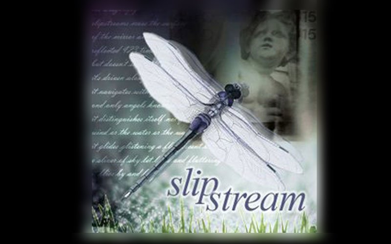
A masthead is simply a collage, a combination of images that set a theme for what your site is about, what you're interested in, and is appealing to your potential employer. For this exercise, I will use my already created collage - "The Dragonfly." Since I wish to make my theme around "art/creativity" I'll use my collage which communicates both, because I'm likely going to apply for an art director's job.


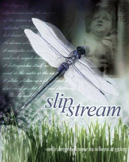
I'm going to create an "index.htm" page, and then a content page, or a "home.htm" page. These two pages will be quite different in layout. Let's do the index.htm page first. I'm simply going to use my collage as the main layout, except that I'll make the dimensions 800x500 pixels.

In order to make it fit, I've centered my dragonfly collage in the middle of my 800x500 canvass area. I filled the background with black. Then I deleted the top and bottom of the dragonfly collage image, and using the rectangular selection tool, selected a horizontal area around the top, and then the bottom, and used the Guassian blur tool at 10 pixels to blur the edges of the top and bottom. This makes it look like the image belongs in the centre of the image, and blurs into the black background.


I realized I wanted to create a rollover for this centre image. Once a visitor comes to the site, and places their cursor over this image, then I wanted the dragonfly collage image to change to black and white (to show that it is active) and add the words "click to enter." This I added in red, with a white glow around the lettering.


Creating the "home.htm" page

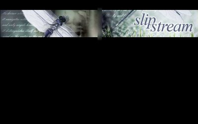
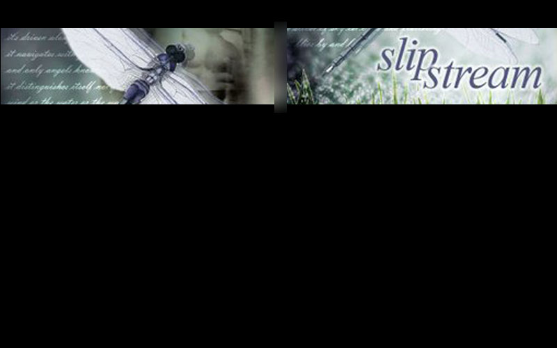
Now I need to design a page, using a masthead, employing the dragonfly collage, while also adding a navigation bar, and an area in which to place my content/text.

I'll begin with creating a masthead, using the dragonfly collage. The webpage will be 800x500, and the masthead/collage needs to be 800 pixels x 110wide. Using half the width, I selected half the area with the rectangle selection tool, then used "Paste Into". The dragonfly collage image was pasted into this area, which I then used CTRL T (Transform) and enlarged it until it fit the area. Then I repeated this process for the second half of the 800 pixel wide banner, but this time I focussed on the "slipstream" word. I again enlarged the image until it fit the second half.

In order to make the two halves blend together, I merged the two layers, then selected the area between them, and used the Gaussian blur filter to make them blend together. Here is the effect:


Now I need to add the "logo" or my name. Again, I'm keeping it very simple. I know from experience that keeping your "logo" very simple is the best direction, especially when it comes to corporate communications (such as your resume/portfolio web site), because anything more fancy appears like you're trying to sell yourself too hard. So I made "michael" in regular arial, and "jorgensen" in "arial black". Feel free to use this method yourself. You can change fonts, but keep your first name in a thinner font, and your last name in a thicker font. You could add interesting characters between your first and last name, such as a "|" or a "/" or an underline "_" or a square, a circle, a star, etc. In this case I decided to use my dragonfly icon to separate my first and last name. And I placed it on the top left handside, above the masthead. You could also change the colour of either your first or last name to add visual interest.


With a "Masthead" design, it's likely that you'll add your navigational bar down the left hand side (sometimes the right hand side) of your web page. Keeping the text of the links simple, possibly having a background or shape around them are possibilities. Here, I've opted to keep the minimalism, and just used Times New Roman Italic, to mimic the "slipstream" word. I've given the white text a slight blow "glow". If these were rollovers, I might change the colour to the greyish blue I used in the main text area.

I decided not to put additional html links at the bottom, since the entire page appears within one screen, and no scrolling will be required.

I decided to make the text/content area black, like the rest of the back. This keeps the dramatic effect, as well as an overall visual consistency. The text used was Verdana, 11pt, with extra spacing. I added a small picture of the dragonfly to break up the block of copy, and add visual interest.

Notice how I tied the theme in from my masthead and index page, into the introductory copy. This is important to put your theme into context. I'm probably exaggerating the themes in the copywriting, but I did so, to show you how it could be done.

Finally, I added a copyright notice at the bottom.

Now I can use this "home.htm" page for each page, just changing the content and small images for each.

It's easy to use, simple to comprehend, easy to change - yet has a consistent and hopefully interesting visual interface. Much more could be experimented with...but at least this gives you an idea of how to approach a MASTHEAD TYPE web site. Keep it simple, dramatic, fun, and you'll get people's interest.


Feel free to follow similar steps in the design of your own web site!

POSTSCRIPT

After thinking about the design overnight, I was unsatisfied with it, and came up with some new ideas. I redid the collage completely so that it fit better in the masthead, I made the dragonfly overlap the masthead to add visual interest, and changed the background from black to a gradient using greys. I also made the paragraph begin with a "headline" to lead the reader into the copy.


Instead of user "outer glow" filter on the navigational bar text, I decided to use a "drop shadow," and also applied this to my logo name and picture. Finally, I used 80% black for the bodycopy - this is a trick used by professional graphic designers to make bodycopy more "designy," rather than just using 100% black.
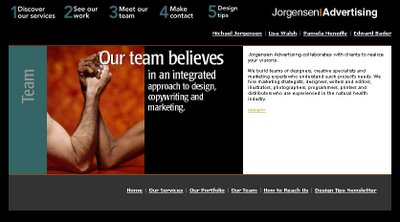
________________________________________

NON-MASTHEAD SITES

The other style of web site you may wish to consider is the non-masthead site. In this instance, the navigational bar is kept very simple, and visual interest is mostly created by adding different images on each page. Take a look at this page from Deric Olsen's web site, promoting his new movie "The Phoenix Agenda." Deric is one of the instructors in New Media, and just completed his Masters in Film Studies at the University of Regina.


Note that his navigational bar is placed underneath the main window. He's used graphic devices to suggest "hi-tech/military/surveillance." Especially take note of what he's done with his rollover buttons - square brackets appear and the rollover text turns blue - a very cool effect, consistent with his theme.

Instead of using html text, he decided to design the entire page using Photoshop - the text is part of the image. While this takes up more downloading time because it is an image, most people use high speed internet, so it isn't a real problem. Also, the window area is not too large, and is kept consistently the same size throughout the site. This is an option you may wish to consider.


Notice the elegant simplicity of the Karacters Design Group web site. No masthead is employed - instead, an animated image changes every few seconds on the right hand side. The text (which is a pixel font) is kept to a minimum, and appears underneath the simple navigational bar.

In terms of using images on your web sites, here are some suggestions:
Keep a consistent theme, such as:
- black and white images of Lethbridge and/or the University
- computer programming related images if you're a programmer
- images of volleyball or skiing, if this is one of your passions
- if you're into art, then use some of your favourite images by other artists.
The options are nearly endless.


In my old Jorgensen Advertising web site, I used images and words combined. By taking a key phrase and laying it over top of a related image, I was able to emphasize my intended message. On the right hand side I used html text for the copywriting.

While you're studying web sites, take a look at these two main approaches and find one that will work for your target audience(s) and with your thematic approach.

Dreamweaver Instructions

Click here to view a page with some basic Dreamweaver Instructions for designing your web site.

The topics include:
• Creating your Web Site Folder
• How do I define my LOCAL ROOT FOLDER?
• What palettes should I have selected once I open Dreamweaver?
• Properties Palette
• How to make a table
• What size should my copy be?
• How do I create a rollover image for my navigational bar?
• How do I insert an image?
• How do I add a colour to my table cell?
• How do I add colour to the background of my Web page?
• How do I create Portfolio pages?
• How do I FTP my files to the World Wide Web?

Tuesday, March 6, 2007

Introduction to Web Site Design

• The internet isn’t located in any single place, isn’t based on any central computer, and isn’t overseen by any network manager.
• Developed in the 1960s as an experiment by the U.S. Department of Defense as a way to communicate - using TCP/IP. To ensure the internet could not be interrupted by enemy attack, TCP/IP was designed to create a decentralized system.

• Ways to communicate on the net:
• E-mail
• FTP (file transport protocol)
• Newsgroup
• Telnet (programs)
• WAIS (searches)
• World Wide Web (multimedia pages, hyperlinks and based on html)

• World Wide Web invented in 1990 by CERN, group of European scientists
• 1993 - Mosaic - first graphical browser
• 1994 Netscape Navigator 1.0 (Internet Explorer is now at version 7.0)
• Development is explosive!

Constant Change: Imagine a publishing medium where nothing is ever final, where designs can be changed at will and new information can be published within minutes of hearing it, where ideas can be tested and discarded-or built upon-as soon as you test your audience’s reaction to them, and to which readers can return time and time again and find new information at each visit. That’s the world of the web. Understanding its fast pace is an important key to success in the medium.

Definitions:
• Http: hypertext transfer protocol allows hyperlinks to another page anywhere in the world.
• HTML: hypertext mark up language - standardized language or format used by browsers

Nonlinear Design:
• The web is nonlinear: It’s about letting the visitor choose his or her own path through the information
• In this context, you’ve got to make each and every page well designed, attractive, easy to read and have relevant content

Each page important:
• Every page should entice the visitor to explore your site further and make it easy to do so
• It must introduce an idiosyncratic identity among the dozens of sites the visitors may view in the space of a few minutes.

Page layout is uncontrollable:
• Page layout and design isn’t entirely controllable by designer
• Defaults are different for each user – text size, font, screen resolution, screen brightness/contrast
• Different browsers make page appear differently – Internet Explorer, Firefox, Opera, Safari
• Different versions of browsers handle code differently
• Platforms affect appearance - PC or Apple Macintosh
• Fonts used on web page may not be installed on viewer’s computer so may not show as intended
• Good web design includes the art of creating pages that can be viewed successfully under a number of different conditions.
• Avoid using frames
• Keep it simple

Capabilities always growing:
• World Wide Web Consortium (W3C): A group, composed of volunteers from Internet software companies, academics and other interested parties, that oversees the development of Web technologies. Formed in the fall of 1995.
• HTML’s capabilities are changing all the time - HTML 2.0 - HTML 4.01.
• Designers must constantly educate themselves and designs must be updated regularly.

Download Time Sets the Standard:
• The Web is capable of all the multimedia associated with CD-ROM: immersive 3D graphics, animation, digital video.
• As band-width improves and sites become media-rich, producing a web site could demand all the skills of producing a film, requiring professional video and sound production - even actors

• One of the web designer’s greatest challenges is to execute ideas using the smallest possible file sizes.
• If users have to wait more than 5-10 seconds, they’re gone.
• Good web design means good content, well organized, and speed over everything else.

Process of Web Design
• Quick changes in technology may quickly put some tasks handled by production engineers into the hands of web designers

Managing the Project:
• Producer: the job of pulling together the ideas and expertise of individual team members into a coherent plan
• Account Manager: represents the client’s wishes to the team and communicates the team’s ideas and progress back to the client

Information Architecture:
• Planning of content
• Functions: online product sales or community meeting areas
• Product information, etc
• Information Architect: builds a structure for the site that holds the information and offers functionality described in creative brief.
• Site architecture requires very right-brain/left-brain integration. Organize information and realize how it will work onscreen.
• Content involves the services of a copywriter and editor.
• Information Architecture should be driven by human behaviour. You’ve got to make the system fit the user, not the other way around. Focus groups, user testing, and past experience with how users have reacted to earlier designs should be your guide.
• How is content organized and what is the hyperlink structure?
• Even more complex when animation and interactivity is involved: depends on the collaboration of a whole team of talents, including production engineers
• The process of information architecture should result in a document that defines the structure: a storyboard or a branching diagram

Page Architecture and Interface Design:
• Designers decide how the elements of each page will relate to one another and how they interact as a whole
• Create a navigation system
• Graphic Design: defines the “look and feel” for the information, directing the work of illustrators and HTML coders to create a logical, attractive and appropriate interface design.

Programming and Scripting:
• Beyond simple tools for interactivity (hyperlinks, e-mail) a programmer is required to develop things such as collecting data from forms or returning automated responses to a user’s input or actions
• Some designers know basic HTML, but specialized programmers are required for interactive interfaces, hooking in back-end databases, and creating custom behaviour using programming languages such as Java
• The link between programming and design has become even tighter (Flash animated sites)

Production:
• WYSIWYG HTML Editors (Dreamweaver)
• Production engineer’s responsibilities include: Setting up and saving the files in an appropriate directory structure in the server HTML coding, or verifying and fine-tuning HTML files supplied by designers
• Preparing graphics and other media for low-bandwidth transmission
• Writing any necessary scripts
• Creating and testing the hyperlinks
• Making sure the code works in target browsers

Publishing:
• The engineer copies the final files into the appropriate directories on an HTTP server (using an FTP program).
• Most web teams use a staging server on which final files are posted and links, scripts and other functions are tested before the site goes “live.”

Three Main Categories of Web Sites:
• Information publishing: onlnine newsmagazines or information sites such as www.nationalgeographic.com or www.uleth.ca. There is much up and down scrolling on these sites, and content is put into 'bite-sized' chunks with images to break the monotony of text
• Brochureware (brochure + software): Web site appears all on one screen - no scrolling is required. Often used for design companies.
• E-commerce (a combination of information publishing and brochureware + method of purchasing online): www.amazon.com for example
• Digital Storytelling (an experimental and artistic approach to web site design): see Memory's Voices