Tuesday, February 27, 2007

Using Guides in Photoshop


Using guides and the grid

Guides appear as lines that float over the entire image and do not print. You can move, remove, or lock a guide to avoid accidentally moving it.

In Photoshop, a grid appears by default as nonprinting lines. The grid is useful for laying out elements symmetrically.

Guides and grids behave in similar ways:

Selections, selection borders, and tools snap to a guide or the grid when dragged within 8 screen (not image) pixels. Guides also snap to the grid when moved. You can turn this feature on and off.
Guide spacing, along with guide and grid visibility and snapping, is specific to an image.

Grid spacing, along with guide and grid color and style, is the same for all images.

To show or hide a grid or guides:
Do one of the following:

Choose View > Show > Grid.
Choose View > Show > Guides.
Choose View > Extras. This command also shows or hides: selection edges, target path, slices, and notes.

To place a guide:

If the rulers are not visible, choose View > Rulers.

Note: For the most accurate readings, view the image at 100% magnification or use the Info palette.

Create a guide:

Choose View > New Guide. In the dialog box, select Horizontal or Vertical orientation, enter a position, and click OK.

Drag from the horizontal ruler to create a horizontal guide.

Hold down Alt and drag from the vertical ruler to create a horizontal guide.
Drag from the vertical ruler to create a vertical guide.

Hold down Alt and drag from the horizontal ruler to create a vertical guide.

Hold down Shift and drag from the horizontal or vertical ruler to create a guide that snaps to the ruler ticks.

The pointer changes to a double-headed arrow when you drag a guide.

To move a guide:

Select the move tool , or hold down Ctrl (Windows) to activate the move tool. (This option does not work with the hand or slice tools.)

Position the pointer over the guide (the pointer turns into a double-headed arrow).

Move the guide:

Drag the guide to move it.

Change the guide from horizontal to vertical, or vice versa, by holding down Alt (Windows) as you click or drag the guide.

Align the guide with the ruler ticks by holding down Shift as you drag the guide. The guide will snap to the grid if the grid is visible and View > Snap To > Grid is selected.

To lock all guides:

Choose View > Lock Guides.

To remove guides from the image:
Do one of the following:
  • To remove a single guide, drag the guide outside the image window.

  • To remove all guides, choose View > Clear Guides.

To turn snapping to guides on or off:

Choose View > Snap To > Guides.

To turn snapping to the grid on or off:

Choose View > Snap To > Grid.

To set guide and grid preferences:
Do one of the following:

In Windows, choose Edit > Preferences > Guides, Grid, & Slices.

For Color, choose a color for the guides, the grid, or both. If you choose Custom, click the color box, choose a color, and click OK.

For Style, choose a display option for guides or the grid, or both.

For Gridline Every, enter a value for the grid spacing. For Subdivisions, enter a value to subdivide the grid.

If desired, change the units for this option. The Percent option creates a grid that divides the image into even sections. For example, choosing 25 for the Percent option creates an evenly divided 4-by-4 grid.

Click OK.

Thursday, February 15, 2007

Barbara Kruger


After attending Syracuse University, the School of Visual Arts, and studying art and design with Diane Arbus at Parson’s School of Design in New York, Barbara Kruger obtained a design job at Condé Nast Publications. Working for Mademoiselle Magazine, she was quickly promoted to head designer. Later, she worked as a graphic designer, art director, and picture editor in the art departments at House and Garden, Aperture, and other publications. This background in design is evident in the work for which she is now internationally renowned. She layers found photographs from existing sources with pithy and aggressive text that involves the viewer in the struggle for power and control that her captions speak to. In their trademark black letters against a slash of red background, some of her instantly recognizable slogans read “I shop therefore I am,” and “Your body is a battleground." Much of her text questions the viewer about feminism, classicism, consumerism, and individual autonomy and desire, although her black-and-white images are culled from the mainstream magazines that sell the very ideas she is disputing. As well as appearing in museums and galleries worldwide, Kruger’s work has appeared on billboards, buscards, posters, a public park, a train station platform in Strasbourg, France, and in other public commissions. She has taught at the California Institute of Art, The School of the Art Institute of Chicago, and the University of California, Berkeley. She lives in New York and Los Angeles.

Take note of how Kruger uses a combination of artwork and text - her text is not a straightforward interpretation of the image. Instead, it creates a sometimes ambiguous relationship with the image. Through the use of both evocative statements and imagery, the viewer contemplates the relationship between the two.


Tuesday, February 13, 2007

Self-Portrait Gallery


Tips for Creating a Collage

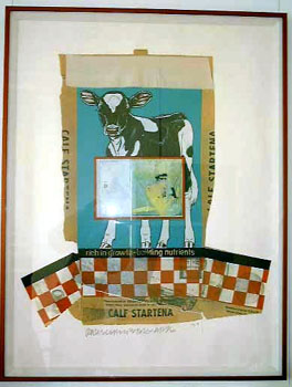
1. Research other artists' work, and choose a collage style that you'd like to work in and inspire your own work. I've chosen the work below:


2. Analyze and deconstruct the elements of the collage and its style.
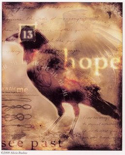
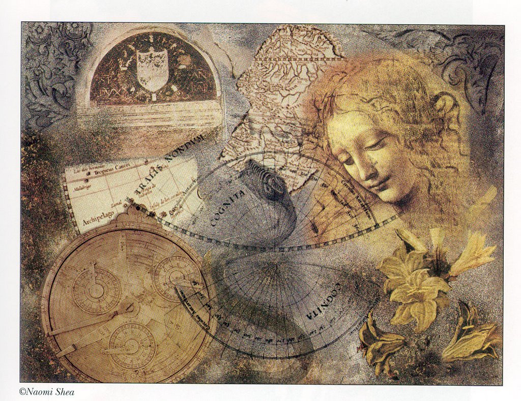
In the work above, the artist has chosen as the central element a crow, and made it have the greatest emphasis in the piece. By selecting a powerful symbol, the artist has the opportunity to play with related or contrasting elements in the rest of the work. As well, the collage will resonate emotionally and intellectually with the viewer.

Note that the text used in the background is placed on a mottled, textured background. The text itself employs key words that are related to the crow symbol: messenger, gift, prophecy, flight, life, etc. An additional theme is added with examples of ties or knots, and the words "untie me." A handwriting font has been used to suggest journalling, or a personalized message.

In contrast to the crow being a harbinger of death or evil, the artist has highlighted the words "hope" and "see past." It seems that the artist wants the viewer to "see past" the negative connotations of the crow, and recontextualize it into a message of hope. Another view of the crows wings are superimposed and made partially transparent in the background, suggesting angel wings, or at the very least, flight.

At the same time, the negative connotation of the crow is reinforced by using the number "13" on top of its head.

A compass dial is superimposed over a part of the bird, suggesting flight, movement and direction, one of the repeated themes.

There is a reinforcement of the negative themes, then a reconstruction of new themes throughout the piece. By juxtaposing these, it allows the viewer to participate in the construction of new meaning, as opposed to delivering a consistent, literal message.

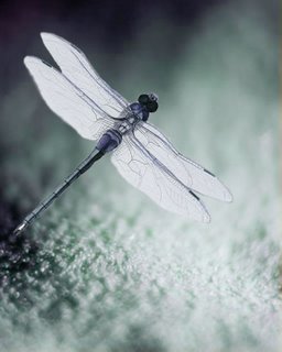
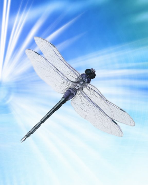
3. So, how do I apply this to my own work?

Choose a powerful symbol that resonates with you. For example, a dragonfly is a symbol that resonates powerfully for me, and I will choose to use this in my own collage.


On the internet and at the library I researched the dragonfly - in particular the fluorescent blue dragonflies I've seen in Southern Alberta this summer. It is known as Boreal Bluet. I discovered that they have the largest eyes of any insect proportionate to the rest of their body, and that there are 432 facets per eye. I learned that they spawn in water, and love to skim across the surface of water. I didn't find any information on the meaning of dragonflies as a symbol...nevertheless, I reflected on what I find fascinating and beautiful about them, and ended up writing a poem.

the dragonfly
slipstreams cross the surface
of the mirror and is
reflected 423 times two
but doesn't see itself because
it's driven along by the current
it navigates with gossamer wings
and only angels know to where it goes
it distinguishes itself not from the
wind or the water or the waves of grass
it glides glistening a fluorescent blue
a sliver of sky let loose and fluttering
it flies by and by

In your own work, do some research on your symbol, write a poem, or find others' poems and writings you can use in your collage.
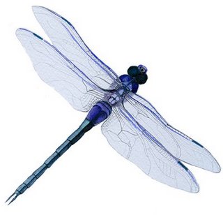
4. Choosing pictoral elements

I began with doing a search on www.photodisc.com for a background water image. This was my first attempt:


But I realized it was too 'pretty.' I was looking for a more dramatic and edgier effect. So I tried another water background, with more dark areas:


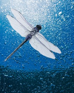
The effect is okay, but I realized the water image was overtaking the dragonfly image. I changed tacts, and did a search on PhotoDisc for an earth background, and found this:


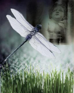
I liked the monochromatic colours of this background and the fact that it did not overwhelm the dragonfly which should be my main emphasis. I decided to go with this background.

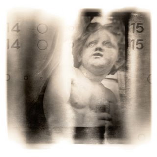
To decide on what other images to add, I looked through my poem, and saw the key words "angel," and "blades of grass." After doing a search on PhotoDisc, I found this cute but ugly stone angel. Again, when we think of angels, we usually think of a beautiful image - to play against that expectation, I chose an image that was stone, chubby, and roughly photographed.


It seemed to fit at the top right hand side, and I used "Multiply" blending on the layer to merge it with the background. I found an image of "blades of grass" which I pasted onto the bottom, and used "Hard Light" layer blend and a Gaussian Blur of 1.0 pixel.


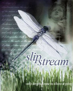
I looked for a word that was meaningful, but not too literal within my poem, and decided upon "slipstream." I used Times New Roman, but made it italic to give it movement (like the word). I put it on two lines and put it in all lowercase to make it look more poetic. And I added an outer glow.

Finally, I added my poem using a script font, and used the Overlay effect on the layer, so that the text fades in and out - it's not entirely readable - just a little. Finally, I added "only angels know to where it goes" at the bottom, then "Rasterized" the layer so that I could apply a Wind filter effect to the text. I also made the opacity of the layer 75% so it's a bit transparent. Here's the final piece:


I could keep working on it, but for now, this should give you some ideas on how to construct your own collage.

Friday, February 9, 2007

How to FTP into your P Drive

If you are working at home on a project, and wish to transfer it to your P (personal) drive at the University, this is how.

Using Internet Explorer:

Open Internet Explorer and make sure the Enable FTP option is turned on. This is found under Tools, select Internet Options and click on the Advanced tab and make sure that the Enable Folder View for FTP Sites is checked and click on OK. Now go to the Address bar and type in:

ftp://username@files.uleth.ca

This will get you into your P (personal) and W (web) drive.

You can now simply drag and drop files from your hard drive to your P drive.

Thursday, February 8, 2007

Room to Breathe: Whitespace, Contrast & Balance


Click here to read notes on Whitespace, Contrast + Balance.
Notes are copyright and courtesy of Prof. Christopher Moore

Click here to see examples of print ads that employ white space techniques.

Collage

Collage (From the French, coller, to stick) is regarded as a work of visual arts made from an assemblage of different forms, thus creating a new whole. Read the Wikipedia information on collage.

Photomontage, Digital collage


Digital collage is the technique of using computer tools in collage creation to encourage chance associations of disparate visual elements and the subsequent transformation of the visual results through the use of electronic media. Take a look at Collage for information, in particular Photomontage.

Try creating your own collage with the Collage Machine.


Alejandro Puga - a Surrealist collage artist


Cubist painter, Pablo Picasso, invented the collage technique in 1912 with his Still Life with Chair Caning (Nature-morte à la chaise cannée), in which he pasted a patch of oilcloth with a chair-cane design to the canvas of the piece.


Cubomania is a method of making collages in which a picture or image is cut into squares and the squares are then reassembled without regard for the image.

Robert Rauschenberg

By 1962, Rauschenberg's paintings were beginning to incorporate not only found objects but found images as well--photographs transferred to the canvas by means of the silkscreen process. Previously used only in commercial applications, silkscreen allowed Rauschenberg to address the multiple reproducibility of images, and the consequent flattening of experience that that implies. In this respect, his work is exactly contemporaneous with that of Andy Warhol, and both Rauschenberg and Johns are frequently cited as important forerunners of American Pop Art.