Form follows function
The physical properties of the object or the elements used in the design reflect its meaning, use and purpose.
7 Elements of design
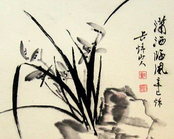
Line: Line can be considered in two ways. The linear marks made with a pen or brush or the edge created when two shapes meet.

Shape: A shape is a self contained defined area of geometric or organic form. A positive shape in a painting automatically creates a negative shape.
Direction: All lines have direction - Horizontal, Vertical or Oblique. Horizontal suggests calmness, stability and tranquility. Vertical gives a feeling of balance, formality and alertness. Oblique suggests movement and action.
Texture: Texture is the surface quality of a shape - rough, smooth, soft, hard, glossy, etc. Texture can be physical (tactile) or visual.
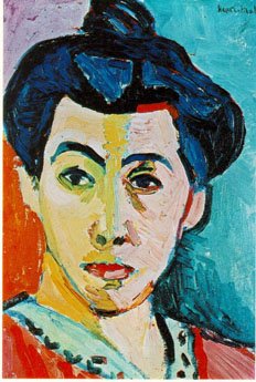
Color: Color or the absence of it is significant in your choice of elements.
Size: The fifth element is size, which is how big or small something is. In design, size can can attract or size can organize. Sometimes size is also called “mass.”
Tonal Contrast: Tonal contrast is simply the difference between the light and dark areas in a painting. The greater the difference the more attention the area attracts.
5 Design Principles
1. Balance
The design must be in balance – have an equal distribution of visual weight. Balance in design is similar to balance in physics. A large shape close to the center can be balanced by a small shape close to the edge. A large light toned shape will be balanced by a small dark toned shape (the darker the shape the heavier it appears to be).
Two kinds of balance:
Formal (symmetrical): Fold your page in half, vertically. If one side mirrors the other, than it is symmetrical balance. It communicates stability, seriousness, the classical and trustworthiness. In advertising, it's often used for institutional and other serious-minded advertising.
Informal (assymetrical): Optical weights are balanced (check in mirror to see if one side is balanced with the other). It can communicate creativity, contemporary, unique, playfulness and originality.

In advertising, the space within the ad should be broken up into pleasing proportions. This relates to the size, shape, and weight of elements to one another. There should be a balance between consistency and variety. Use the 1:3 rule.
2. Emphasis
One element (or one part of an advertisement), should dominate all others.
What one item must be emphasized? (The art, headline, copy block, logo?)
How much emphasis should it get?
Create emphasis by using these rules:
a. Our attention is attracted to first to dark elements, and then to light elements;
b. From unusual shapes to usual or geometric shapes (our brain is attracted to biomorphic shapes before geometric shapes);
c. From colour elements to non-colour elements.
3. Direction
A directional pattern should be evident. In advertising, left to right, top to bottom
designer leads the reader by hand through the maze of the advertisement (artwork, headline, logo, body copy, contact information).

4. Rhythm
Created by repeating or varying elements, giving consideration to the space in between them, which establishes a sense of movement from one element to another.
Repetition and variation is key.
5. Unity
A unifying force should hold the ad together. In advertising, a border or white space is often used.
No comments:
Post a Comment