MASTHEAD TYPE OF WEB SITE
With the masthead-type of web site, you are using a masthead to create a theme, and add visual interest. This masthead remains consistent on each page. All you need to do for each page is to add content, and possibly some tiny images along with your text.
A masthead is simply a collage, a combination of images that set a theme for what your site is about, what you're interested in, and is appealing to your potential employer. For this exercise, I will use my already created collage - "The Dragonfly." Since I wish to make my theme around "art/creativity" I'll use my collage which communicates both, because I'm likely going to apply for an art director's job.

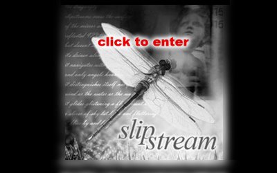
I'm going to create an "index.htm" page, and then a content page, or a "home.htm" page. These two pages will be quite different in layout. Let's do the index.htm page first. I'm simply going to use my collage as the main layout, except that I'll make the dimensions 800x500 pixels.
In order to make it fit, I've centered my dragonfly collage in the middle of my 800x500 canvass area. I filled the background with black. Then I deleted the top and bottom of the dragonfly collage image, and using the rectangular selection tool, selected a horizontal area around the top, and then the bottom, and used the Guassian blur tool at 10 pixels to blur the edges of the top and bottom. This makes it look like the image belongs in the centre of the image, and blurs into the black background.

I realized I wanted to create a rollover for this centre image. Once a visitor comes to the site, and places their cursor over this image, then I wanted the dragonfly collage image to change to black and white (to show that it is active) and add the words "click to enter." This I added in red, with a white glow around the lettering.

Creating the "home.htm" page
Now I need to design a page, using a masthead, employing the dragonfly collage, while also adding a navigation bar, and an area in which to place my content/text.
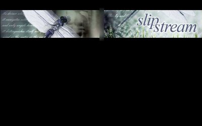
I'll begin with creating a masthead, using the dragonfly collage. The webpage will be 800x500, and the masthead/collage needs to be 800 pixels x 110wide. Using half the width, I selected half the area with the rectangle selection tool, then used "Paste Into". The dragonfly collage image was pasted into this area, which I then used CTRL T (Transform) and enlarged it until it fit the area. Then I repeated this process for the second half of the 800 pixel wide banner, but this time I focussed on the "slipstream" word. I again enlarged the image until it fit the second half.
In order to make the two halves blend together, I merged the two layers, then selected the area between them, and used the Gaussian blur filter to make them blend together. Here is the effect:

Now I need to add the "logo" or my name. Again, I'm keeping it very simple. I know from experience that keeping your "logo" very simple is the best direction, especially when it comes to corporate communications (such as your resume/portfolio web site), because anything more fancy appears like you're trying to sell yourself too hard. So I made "michael" in regular arial, and "jorgensen" in "arial black". Feel free to use this method yourself. You can change fonts, but keep your first name in a thinner font, and your last name in a thicker font. You could add interesting characters between your first and last name, such as a "|" or a "/" or an underline "_" or a square, a circle, a star, etc. In this case I decided to use my dragonfly icon to separate my first and last name. And I placed it on the top left handside, above the masthead. You could also change the colour of either your first or last name to add visual interest.

With a "Masthead" design, it's likely that you'll add your navigational bar down the left hand side (sometimes the right hand side) of your web page. Keeping the text of the links simple, possibly having a background or shape around them are possibilities. Here, I've opted to keep the minimalism, and just used Times New Roman Italic, to mimic the "slipstream" word. I've given the white text a slight blow "glow". If these were rollovers, I might change the colour to the greyish blue I used in the main text area.
I decided not to put additional html links at the bottom, since the entire page appears within one screen, and no scrolling will be required.
I decided to make the text/content area black, like the rest of the back. This keeps the dramatic effect, as well as an overall visual consistency. The text used was Verdana, 11pt, with extra spacing. I added a small picture of the dragonfly to break up the block of copy, and add visual interest.
Notice how I tied the theme in from my masthead and index page, into the introductory copy. This is important to put your theme into context. I'm probably exaggerating the themes in the copywriting, but I did so, to show you how it could be done.
Finally, I added a copyright notice at the bottom.
Now I can use this "home.htm" page for each page, just changing the content and small images for each.
It's easy to use, simple to comprehend, easy to change - yet has a consistent and hopefully interesting visual interface. Much more could be experimented with...but at least this gives you an idea of how to approach a MASTHEAD TYPE web site. Keep it simple, dramatic, fun, and you'll get people's interest.

Feel free to follow similar steps in the design of your own web site!
POSTSCRIPT
After thinking about the design overnight, I was unsatisfied with it, and came up with some new ideas. I redid the collage completely so that it fit better in the masthead, I made the dragonfly overlap the masthead to add visual interest, and changed the background from black to a gradient using greys. I also made the paragraph begin with a "headline" to lead the reader into the copy.

Instead of user "outer glow" filter on the navigational bar text, I decided to use a "drop shadow," and also applied this to my logo name and picture. Finally, I used 80% black for the bodycopy - this is a trick used by professional graphic designers to make bodycopy more "designy," rather than just using 100% black.
________________________________________
NON-MASTHEAD SITES
The other style of web site you may wish to consider is the non-masthead site. In this instance, the navigational bar is kept very simple, and visual interest is mostly created by adding different images on each page. Take a look at this page from Deric Olsen's web site, promoting his new movie "The Phoenix Agenda." Deric is one of the instructors in New Media, and just completed his Masters in Film Studies at the University of Regina.

Note that his navigational bar is placed underneath the main window. He's used graphic devices to suggest "hi-tech/military/surveillance." Especially take note of what he's done with his rollover buttons - square brackets appear and the rollover text turns blue - a very cool effect, consistent with his theme.
Instead of using html text, he decided to design the entire page using Photoshop - the text is part of the image. While this takes up more downloading time because it is an image, most people use high speed internet, so it isn't a real problem. Also, the window area is not too large, and is kept consistently the same size throughout the site. This is an option you may wish to consider.

Notice the elegant simplicity of the Karacters Design Group web site. No masthead is employed - instead, an animated image changes every few seconds on the right hand side. The text (which is a pixel font) is kept to a minimum, and appears underneath the simple navigational bar.
In terms of using images on your web sites, here are some suggestions:
Keep a consistent theme, such as:
- black and white images of Lethbridge and/or the University
- computer programming related images if you're a programmer
- images of volleyball or skiing, if this is one of your passions
- if you're into art, then use some of your favourite images by other artists.
The options are nearly endless.

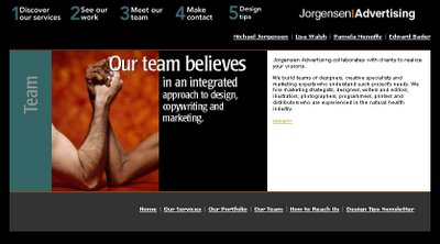
In my old Jorgensen Advertising web site, I used images and words combined. By taking a key phrase and laying it over top of a related image, I was able to emphasize my intended message. On the right hand side I used html text for the copywriting.
While you're studying web sites, take a look at these two main approaches and find one that will work for your target audience(s) and with your thematic approach.
No comments:
Post a Comment